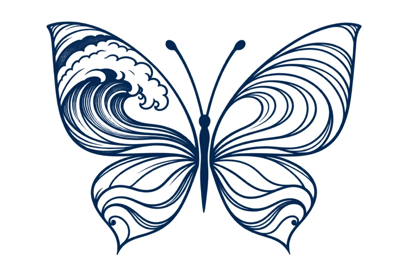
| Defining detail | Breaking wave in one wing |
| Visual movement | Crest against flowing channels |
| Palette | Deep blue linework |
| Protect | Clear spaces between curves |
Find the two kinds of motion
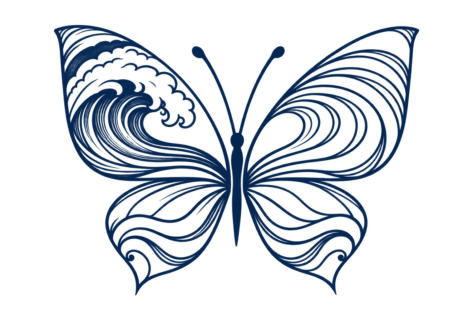
The curled crest on the left is the busiest area. Foam-like shapes and a darker center draw attention there first. On the right, the lines are longer and more continuous. The lower wings echo the flow without repeating the crest, so the composition has a focal point rather than four equally loud panels.
Look at the clear channels between the lines. They are part of the design, not unused space waiting to be filled. When comparing versions, check whether the wave remains readable as a wave and the butterfly remains readable as a butterfly. If either disappears, remove a few interior curves rather than adding more outlines.
Choose a connection that belongs to you
The ocean might suggest a home coast, a journey, a place of calm, or the feeling of starting again. Those are personal interpretations. The design does not carry a single traditional meaning that every wearer must accept. Write a small brief about the place or feeling you want to remember.
If a particular coastline matters, a subtle contour or wave direction could make the design more specific. Avoid squeezing coordinates into the narrow body unless readable text is a priority. Sometimes a private connection is stronger when it stays in the drawing rather than being explained with an extra caption.
Keep the wave legible at the final size
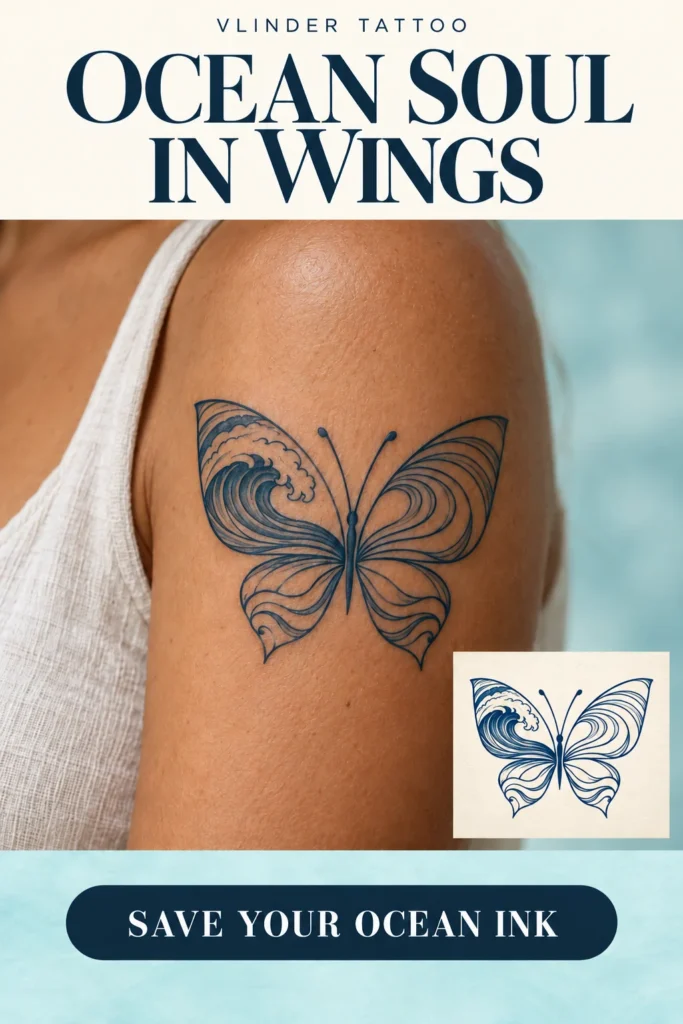
The reference uses a broad upper-arm placement, giving the crest and long curves room to separate. Before trying a smaller wrist or ankle version, ask the artist to redraw the wave with fewer lines. A reduced design should be a deliberate variation, not a tiny photocopy of the detailed one.
Print the image at your proposed size and look from a normal conversational distance. Which part is visible first? Does the darker crest pull the entire design to one side? This simple composition check is more useful than choosing dimensions from a generic online chart. Your artist can adjust the balance for the exact placement.
Decide how the wings sit on the body
Open wings can sit across the upper arm or tilt slightly with its curve. Ask to see the drawing with your arm relaxed, then from the side. A flat image shows all four wings at once; a rounded placement may not. That is an optical problem for the final layout to solve.
A shoulder version could follow the diagonal of the upper wing; a forearm version might need a taller shape. Keep the long water lines moving in a consistent direction so the eye travels toward the body of the butterfly. Avoid adding a large splash outside the wings unless you want to change the clean outer silhouette.
Use the download as a conversation piece
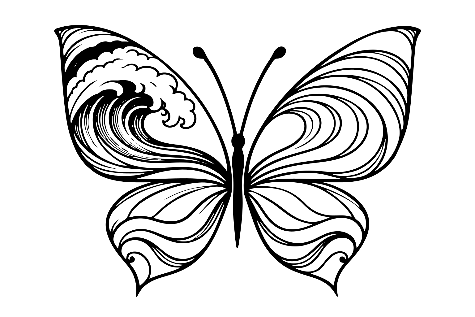
The free pack gives you an isolated reconstruction, a white-background reference, a simplified SVG trace, and printable sheets. Use the original image to check the crest, lower-wing tips, and line spacing. The reconstruction does not recover the hidden original drawing behind the photographed placement.
Ask your artist which curves they would preserve and which they would combine. A good final brief might be: keep the breaking wave on the left, keep the open upper-right channels, and let the lower wings stay light. That is precise enough to guide the work while leaving room for an artist's judgment.
A few useful answers
Is the wave a copy of a named artwork?
The supplied design is discussed as an ocean-inspired composition. No attribution to a specific historic artwork or artist is claimed.
Should both upper wings have a wave?
They could, but the current design relies on a detailed crest on one side and calmer lines on the other. Repeating the crest would create a different balance.
Yours to take to the artist
Your free reference pack.
Keep the idea, mark your preferences, and discuss the final drawing with your artist. Includes PNG, JPEG, a simplified SVG trace, A4 and US Letter sheets, and the supplied source image.
Download the free reference packA reconstructed artist reference, not exact original artwork or an approved stencil. The SVG simplifies detail. Personal-use terms apply.
Editorial note: this is visual analysis of a supplied illustrative design. Suggested meanings are personal interpretations. Reconstructed references may differ from the source and need artist review. This is not medical advice, tattooing instruction, or evidence of healed results.
Build your artist brief · Compare placements · Suggest a correction