
Start with three images, not thirty
A large saved board can make every choice feel equally important. Pick three references and write one sentence under each: I like the wing shape, I like the sense of movement, or I like the private story detail. Do not begin by trying to combine everything you have saved into one tattoo.
The exercise separates the idea from the styling. You may love an ankle photograph because of its warm light and jewelry while preferring the butterfly shape from a wrist reference. Name those differences before asking an artist to design your own version.
Choose the silhouette first
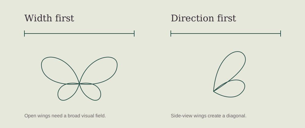
An open-wing butterfly feels balanced and graphic. A side-view butterfly can feel taller and more in motion. A design with a leafy stem or dotted trail extends beyond the wings. Compare those three broad structures before deciding on tiny vein patterns or shading.
Look at the outline at a normal size rather than zooming in. If you would not recognize the design without its smallest detail, ask whether that detail should become larger or whether the composition needs to be simpler. A clear silhouette gives every supporting mark a job.
Give one detail the leading role
The letter design has a handwriting fragment. The doorway design has an arch and an open door. The map design has two points connected by a route. Each has a central idea, even though the surrounding wings remain decorative.
Choose one personal detail you would regret removing, then keep the rest flexible. A meaningful motif does not need a date, a name, coordinates, a flower, and a quotation all at once. Your brief can be personal without requiring every viewer to read the full story.
Separate inspiration from claims
A stylized map is not automatically an accurate map, and a decorative branch is not automatically a specific plant. A Delft-inspired pattern is not proof of historic provenance. If accuracy matters, bring reliable source material and tell the artist which features must be verified.
The same care applies to lettering. The little marks inside a reference may not form readable words. Supply your own checked text when you want a real message. Avoid sharing private documents publicly when a small selected fragment will do.
Use the free files thoughtfully
Each image-based article includes a source placement image, an isolated reconstructed reference, and a downloadable pack. PNG and JPEG files are useful for viewing; printable sheets are useful for notes. The SVG is a simplified vector trace of the reconstruction, not the original drawing or a certified stencil.
Compare the download with the source. Mark any line or detail that must be checked before use. A professional final drawing may change the reference to improve its clarity or adapt it to a placement. That is part of creating a design for you, rather than copying a photograph without judgment.
Leave the consultation with a useful brief
Write down the intended placement, preferred orientation, one essential detail, optional decoration, and any text that needs checking. Ask to see the final drawing at the proposed size and from the viewing angles that matter to you. Ask the artist which changes they recommend and why.
You do not need to have every technical answer before the consultation. You need a clear description of what you like and room for an artist to assess the design. Save the reference, keep the notes, and take time to decide whether the finished composition feels like your own choice.